The Challenge
In 2015, Microsoft Azure was working hard on making customizable dashboards for users possible. Application Insights, which lives in Azure’s portal, needed an experience for creating and editing charts and grids in the new dashboard framework. The biggest challenges were tight time constraints, quickly learning a complex domain, the need to align with many other product teams, and limited research resources.
The Discovery
Prior user research for this project revealed that people wanted dashboards that they could share, customize and curate themselves. Providing this capability would give them quick overviews, helping them easily and logically manage applications and operations. For Application Insights, it was important to maintain consistency and preexisting mental models, yet recognize opportunities to fold in overall improvements when appropriate.
The Outcome
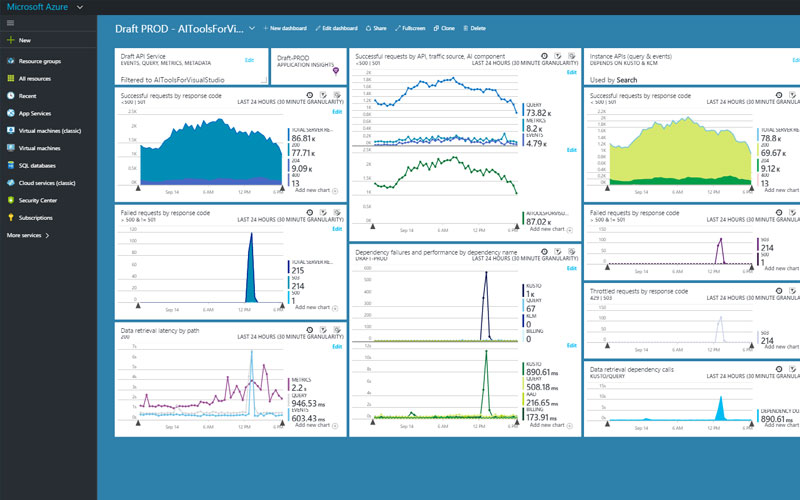
The outcome of this project was the launch of asset creation, editing, filtering, and time management for Application Insights charting on dashboards, while playing well with other Azure products in the portal. This new feature provided unrestrained flexibility and customization, making it easier for dev/DevOps professionals to monitor the health of applications. They could now start with curated overviews, then drill down to investigate, increasing diagnostic efficiency.
Research & Plan
New to Microsoft Azure and Application Insights, work began with learning about the domain. I collected as much information as possible by familiarizing myself with existing design patterns and consulting my colleagues. I explored how dashboards are created in other products to understand the competitive space.
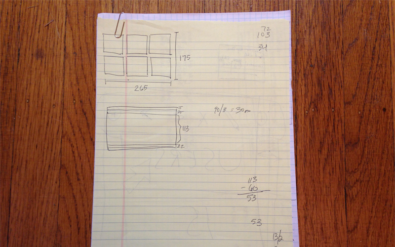
I worked closely with the project owner to gather specifications, steadfast limitations of the SDK, and to discuss early conceptual ideas. Working in pieces and cycles, I went back and forth with information collection and sketching to communicate low fidelity interaction concepts to appropriate team members. Once viable options were worked out, I added visual design polish and began cycles of review with various external groups to ensure alignment and feasibility.
Design
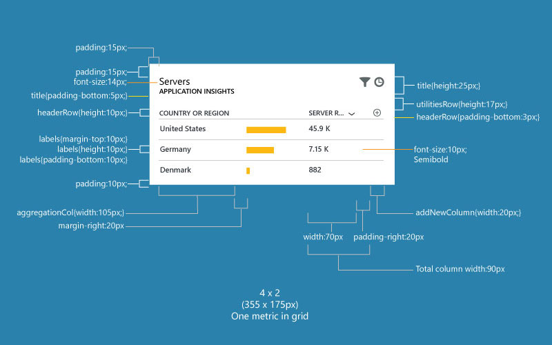
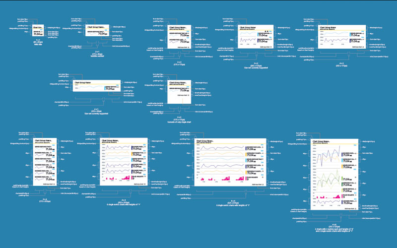
While working with my immediate team and looping in external groups, I also participated in regular design critiques to ensure product and brand alignment. Once a design piece was thoroughly vetted, I produced flows and specifications for behavior and visual design for front end developers. You can view examples of specifications for tile sizes in the aside images.
Due to limited time and resources, research for this project phase was also limited. I relied on good communication, diligent information collection, reasonable assumptions and followed best UX practices to make many of my decisions. If I had continued to work on this product on a V2, I would want to look at a number of things to get feedback and discover pain points.


